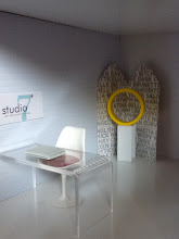
Showing posts with label modern. Show all posts
31 May 2013 0 comments

Deer John...

Here is a peek at the room I pulled together for Rosa's II Anniversary Contest.

12 April 2013 0 comments

Spotted on Pinterest


I like this photograph because it demonstrates how these scaled 
miniature classics are wonderful sculptural pieces.
02 March 2013 6 comments

Tour: Princess' Playhouse


I continue to play with this Videolicious app to make (extremely) short videos. I apologize for some of the unsteady clips in this my first dollhouse tour.  I've included a brief fact sheet on the playhouse owner. Her name is Princess P.
  • Age: 14
  • Religion: non-denominational Christian w/ heavy Buddhist influences
  • Hometown: Hilton Head, SC (people besides tourist actually do live there)
  • Favorite subject(s): Math, Art
  • Favorite sport: Basketball, she's starting point guard for her school JV team
  • Hobbies, interests and preoccupations: the 80's (because that's when video games were born), model building, 60's POP Art, anime, motorcycles & scooters, surfing & skateboarding, the color green, flavored lip gloss, Drake and Justin Beiber, silly bands, Boathouse smoothies, Settlers of Catan, legos (the architect sets) 
  • Dislikes: intolerance, people with a large carbon footprint, cold weather, brussel sprouts
  • Future Aspirations: move to San Francisco & become an animation expert and video game designer; loose her Southern drawl and speak fluent Japanese by age 18; a green planet and world peace
14 February 2013 10 comments

February Design Challenge Round-Up

Seven short days ago, I laid down a quick & dirty challenge for modern miniature enthusiasts everywhere to create a scene honoring their favorite holiday (or observance) in the month of February. You've all responded so enthusiastically and I'm so feeling all the love! (cause who wants to be talking to themselves, right?) As of today, we have quite a nice round-up and while Valentine's Day was by far the most represented holiday, a few others had a moment in the spotlight even a few (gasp) that don't fall in the month of February.  We also had recurring themes like decadence and indulgence, as well as a few repeating icons. Any guess as to which ReacJapan designer chair made the most appearances in scenes?

The journey began with color and glitz of carnival over at Minis-B-Happenin' with a mini-sized float for one of the many Mardi Gras parades that was large on talent, creativity, and diva personalities. We were then asked to consider what makes Valentine's Day different from (college) spring break over at the Hard Way. Remember all the excess of young love? Apparently, there's a reason why the young guys want to make sure a girl's glass is never empty. Then we had three scenes that turn up the romance quotient.  There's a chic, mid-century scene set for a pair of "LOVE"birds over at Mini Mod Pod while Modernist Molly prepared a cozy custom made bed in a lodged decked out with all the modern trappings.  It's all hearts and rose petals at Mini Modern Mind. Wouldn't we all loved to be so spoiled (grins from ear to ear)? We're  then hit by a cold dose of heartbreak with Jazzi Mini's ode to the single woman. It's a macabre Valentine's scene that takes a turn towards the horror of Halloween. Finally, I created my own take on Valentine's Day that I called, A Love Supreme. It's full of love but  not solely the romantic kind (wink). It overflows with references to many other holidays and observances as well.

ReacJapan dollhouse mid-century modern miniatures design
A Love Supreme, a room bursting with references to love.
Thanks once again to everyone for such a wonderful trip.  Haven't pulled together a scene? There's still time, just let me know the link and I'll add it in an update to this post throughout the rest of this month. Happy (holiday of your choice) Day to everyone!

Update 2/28/2013:

Mary's scene is at http://msminiandmore.blogspot.com/2013/02/happy-valentines-day.html

Mini Dork's scene is at http://modernminihouses.blogspot.com/2013/02/loss-for-words.html


5 comments

Challenge Reveal: A Love Supreme

Earlier this month, I began working on a scene to feature some of the new items I purchased or received as gifts. Last week I decided to pull the rest of you miniaturist in when I posed a quick and dirty little challenge but then I went and got all more is more. Hey it's all still very modern, plus it tells a story or 10


Welcome to the craft room/studio for two sisters. Meet the Illustrator and the Cellist, neither has a valentine this year so they chose to be one another's. Their month has been busy thus far. They've attended a number of events from a Wear Red dress fashion show to raise money for heart disease in women, to a National Black HIV/AIDS Awareness Day seminar, to performing in the Vagina Monologues which raises money to end domestic violence.


These ladies are so full of talent they each suffer a bit from adult ADD (attention deficit disorder) and this room truly reflects that fact.  

After spending time earlier in the week enjoying songs from the John Coltrane catalog like A Love Supreme and making cards and such, they've decided to spend the evening watching movies. Up first...Imitation of Life. A powerful story about maternal love. Followed by...KamaSutra. It's about...well, the name says it all! Breakfast At Tiffany's, The Notebook and Love Jones round out the roster of pull-at-your-heart-strings tales of love (and/or romance). The snacks are in place. Tonight they dine on sushi and chocolate. Why you might ask? Because it's great to feel sexy always, weather one has a man or not, no? 


Happy Valentine's Day! Be sure to click through the link to read more about the February Design Challenge reveals.

Details: Lil'Bratz Stylin' Space from eBay; cork side table with script from PRDminiatures, bottles filled with micro beads purchased from The Dollar Store; scrollwork mirror purchased from local flea market; red vase inside bookcase was swap gift from Mini Dork; "Love" cut-out was a gift from The Shopping Sherpa. 


07 February 2013 16 comments

Swaps, Giveaways & A Challenge

Parcels have been crossing the globe and two special one's have found their way to my mailbox. Each quite literally coming from opposite sides of the world.  I just had to share them. First during Inauguration week(end),  I received a hefty package from Mini Dork in California.


This is just my second swap. (Here's more on my first swap.) I'm still a newbie and get very, very excited. Thanks again M!


Quite honestly, I only discovered earlier this week while perusing the archives over at The Shopping Sherpa (TSS) that part of the etiquitte of a swap is to open only one package in the parcel per day until there are no more left. TSS explained it all but I didn't know this until after opening up all this "green goodness" (that was our theme) to discover exactly what I'd received. Now that I'm more informed, I think I just might try to exercise some restraint on the next go 'round. But I'm curious to know just how many of you all open just one package a day upon receiving your swaps? Please do tell!

Next, I was quite surprised to learn that TSS decided to make it rain goodies from one of her favorite stationary shops called Typo. (At least, for everyone who commented on her blog post that day). Woohoo! I like receiving international packages. It's so fun thinking how far it traveled just to reach me.


I received this package of cool laser cut wood icons and one of TSS's postcards showcasing her mad photography skills. It read, "I can't wait to seeing what you make with these."


So I've decided to put out a quick and dirty small challenge. Design a scene around some holiday or observance in February (Valentine's Day, Wear Red for Women, Chinese New Year) you see where I'm going with this, right? I'll be publishing my reveal post next week on Valentine's Day (February 14th). Please try to post your own challenge reveal on (or as close to) February 14 as possible, then link back to this post. I'll add links for everyone who participates, as well. Everyone is a winner here as we add to our blog conversations for this month. Tell me, are you in?
02 February 2013 5 comments

Tutorial: Miniature Magnetic Furniture

napkin rings, West Elm 

Last spring, I picked up a pair of white metal napkin rings from West Elm.  I believed they would be a staple in creating any number of awesome pieces of miniature furniture. Little did I know exactly how much I'd love them and use them again and again. When I returned to the store to buy more, they were all sold out (sighs with disappointment). You can imagine my surprise when an unpainted version reappeared during the holiday season. I've picked up four more napkin rings hoping that will be enough to satisfy my imagination.


These are great supplies for building furniture
with magnets.

I began attaching different shaped magnets to the napkin rings and other metal miniatures I had on hand.  There's a brand called Mighty Magnets that are strong enough to maintain their attraction through glass and acrylic pieces. Great, a chance for more versatility. So this is just about the easiest tutorial ever. Use super strong magnets of various shapes with metal, acrylic or glass to make some awesome modern furniture and fixtures. Unleash your creativity! Check out the pieces I made below.

Metal side tables (horizontal)
Painted side tables (on left: horizontal; center: vertical)
Coffee table (on right)
Vessel sinks on pedestals (on left: tall; on right: low)
Rear center: metal fire pit 
Details: metal and glass condiment bowls are from Ikea; acrylic blocks from Michael's; all magnets purchased from The Container Store

Oh, here's a short little video to sum everything all up...

26 January 2013 4 comments

Elevate Your Style with Jean Prouve

Here's my haul from Spain!
I fell in love with the African stools featured at Minismodernas. I held off making the purchase for some time because I try to avoid international shipping fees.  Alas, these stools were too fabulous to pass up. When I did make my purchase, I added more great items to make the shipping price worthwhile, of course. Everything was well packed and arrived in great condition.  I really like that PayPal was available because it makes transactions so much easier. Thank you Minismodernas!

Guy gets girlfriend and suddenly a little style and flair are
infused into the starter-apartment.
You've seen a version of this scene before.  I began working in the new pieces to raise the level of design. (Maybe our apartment owner just got a new girlfriend.) Prouve chairs are a mid-century modern staple. Perhaps they were purchased from a thrift store in bad condition and refurbished for this starter-apartment? A day spent at the flea market on 26th at the Avenue of the Americas (Manhattan, NY) plus great negotiating skills helped our guy get a deal on the African stool. You get the idea. So have you ever lent your creativity and design expertise to a college boyfriend/future husband (or anyone else) to help them step up their design game? Please, leave a comment and tell me all about it.

04 January 2013 3 comments

Clever Accessory, Great Building Block

I'm so jazzed about this company Kalki'd. They are creating some clever designs for home and garden.  I stumbled across them at cb2 while doing my annual post-holiday shopping for miniatures (think ornaments and small desk accessories---at deep discount). But alas this cool little item was not on sale, a set of four magnets made into miniature cinder blocks! After doing a little research to learn more about the company, I came across this promotional video entitled Concentration.  Take a look and tell me what you think. I hope you enjoy it as much as I did. More to come on the tiny cinder blocks and other shopping haul.

Note:  I purchased these with my own money, they were not a gift. If you like this set of magnets and want to make a purchase, I suggest checking out Emmo Home and Yanko Design which both sell sets of six. cb2 sold a set of four at that same price! Perhaps shipping costs even this discrepancy out.

Details: Video is produced by yayasteven courtesy of YouTube. Learn more at kalikid.com

04 December 2012 1 comments

A Modern Eclectic Style


All I want for Christmas is the new collection of modern furniture pieces from Dolls House Emporium. This room setting from their website was captioned, A Modern Eclectic Style. And indeed it is! I am surprised at how DHE continues to add contemporary and modern pieces to their inventory each year. My number one pick added to my miniature lust list? The Ghost Chair, of course!

27 October 2012 9 comments

Getting Ready for All Hallows' Eve


Played the characters:
Cole & The Source
The Book of Shadows

Accepting Mini Mod Pod's challenge, I pulled together this scene for Halloween.  Looking at it now, it's hard to believe I began with the idea of creating a haunted house but that quickly turned into a room decorated for a Halloween party which finally morphed into...the witches lair. Think good witch as in the television show, Charmed. One may perhaps seek the counsel or protection of a witch just like a palm reader or fortune teller.  But it's not a place that's just easily accessible off of the main street. After all, a witch needs privacy to create potions, cast protection spells, or hold The Source (of all evil) imprisoned in crystals---that's a third Charmed reference in case you missed it. 


When not casting spells and such, the witch takes a load off by
 reclining on the daybed writing in her journal, My Life As A Cat.

This little set up is a private party for the witch and some of her most beloved clients on All Hallows Eve.  There's a chair and a place to recline in the lair.  The real workspace has been cleared of pots, potion bottles, and the Book of Shadows and replaced with party treats...champagne in midnight colored flutes and serving trays full of sashimi and sushi (okay, that's the only tiny food I have.) And for dessert, tiny cakes decorated to look like rolling dice.

Approaching back deck from the right side.
Take a closer look inside.
Guests enter through the door on the left.

Details: Chair, ReacJapan; orange storage tower, Rement; table, orange tray and round platform, The Container Store; food, (magnets) Urban Outfitter; black bird (a wineglass charm) and dice, Morgan Imports; champagne flutes, The Dollar Store; disco ball and picture frame, swap with margaret_loves; dress with hat, The Enchanted Pumpkin--an Etsy store; rug, TheShadeStore.com; yellow book, orange vases and daybed with pillows, Kaleidoscope House accessories; wooden sign, bowl and black barrels, AC Moore; remaining accessories from Dolls House Emporium or eBay; "leather" daybed cover, pumpkins and leaves made by me.

See more Halloween Scenes at Jazzi Minis and MinisBHappenin.

29 September 2012 4 comments

Form Over Fame


Day 59. Image source: brandspirit.tumblr.com

What happens to an object when you take away its branding? Andrew Miller is the branding and marketing strategist behind Brand Spirit, a 100-day design project where he gives us the answer to that very question. He documents the results on his blog by the same name.  He describes the project in this way:
"Every day for 100 days, I will paint one branded object white, removing all visual branding, reducing the object to its purest form. I can purchase each object for less than $10, it can be something I own, something another person gives me, or something I find."


From top to bottom: Days 100, 39, 60, 61 and 14.
Image source: brandspirit.tumblr.com

I really enjoyed this project and was surprised to see how a simple paint job could alter the way I viewed an object. Some of the most humble minutiae from everyday living was elevated into an interesting study in form, perhaps even a soothing sculptural object. Well, that's my take on it but what do you guys think?
22 September 2012 7 comments

Time for a Good Soak


A few new (well, not quite so new anymore) purchases inspired me to create a spa bath room.  You can see from the accessories, I decided to mix modern fixtures with classic and antique accessories to keep things from getting too cold and sterile. I'd love to climb into that free standing tub for a good soak.  Tell me what you think.


Details: bookcases, pitcher & bowl and vase are from Dolls House Emporium; sink & tub fixtures by ELF Miniatures; chair by ReacJapan; vessel sink from Ikea; sink pedestal is napkin ring from West Elm standing on Mighty Magnets from The Container Store; free standing tub from Crate & Barrel; wire baskets are an Etsy shop purchase; TV is a keychain by Kikkerland; telephone is from Rement; wooden backsplash, glass jar, metal box, all mirrors from local craft store; wood flooring are samples from Lowe's; shower and washtub are eBay finds

17 September 2012 8 comments

Fall's Arrival


Like many of you, I jumped at Mini Dork's suggestion to scoop up free samples from The Shade Store and incorporate them into my mini-interiors.  I quickly pulled this scene together after opening up my sample pack. Lot's of color plus a little 70's...Oh joy! Quick trivia question guys---without studying the "details" section how many items used in this scene were free??? Have a great week everyone.


Details: rug by The Shade Store at www.theshadestore.com, floor samples from Lowe's, screen Bumble & Bumble packaging reinvented, coffee table assembled by me with supplies from Michael's and The Container Store, cabinet from an Etsy store, vase is Jonathan Adler for Bozarts' Kaleidoscope House, side table is Rement, and chair is ReacJapan.

07 September 2012 14 comments

Must You Really Do That Here?


I have memories throughout my childhood years of my mother grooming her feet while everyone was gathered around the TV in the family room. To say grooming is very polite. I suppose in the grand scheme of things it was a pedicure but it seemed more like foot surgery. First soaking the feet to softened all of the tough layers of dead skin.  This was followed by lots and lots of peeling skin and picking at corns....well, you get the idea.  Perhaps, if I'd been acquainted with pumice stones back then I could have saved my dear (thrifty) mother so much self-inflicted mutilation.  So this modern living room scene is a tribute to a kinder-gentler version of foot care for mothers well, women everywhere. Note the bottle of epsom salts...And ya'll know how I love my shoes!

Details: white breadboard from Miniatures.com; grey 'wall treatment' and acrylic coffee table top from Michael's; coffee table legs are Mighty Magnets from The Container Store; Couch is Kaleidoscope House by Bozarts Toys; sheepskin, white vase and irises from Dolls House Emporium; chair by ReacJapan; wash basin and painted metal frames are eBay purchases; rug by PRD Miniatures; jar from local bead store; screen, towels and pillow are handmade by me


19 August 2012 37 comments

Sharing is Caring! " Welcome to the Tribe" Give-Away


Off an on for the bulk of this summer, I'd been working on a swap for Megan a.k.a. Mini Dork of the oh-so-comprehensive blog Modern Mini Houses.  I was so happy to learn all items arrived to the  left west coast safe and sound and they have been greeted with great delight. Here's a sample of several of the items Mini Dork received.  I think this coffee table is my favorite but tell me what item(s) you like the best. I designed a few bathroom items to include in the swap as well. I scored a bag of gold champagne flutes* wedding favors.  They add such life and personality to miniature scenes.  You could win set of your very own. (Keep reading...)


Time for A Give-Away. Continuing along in the spirit of sharing, I am giving away the following items to celebrate the fifty followers who joined in the first six months of this lil' blog (and of course, attract a few more).  Thanks again for all your kind comments and support.  I am both honored and flattered to welcome you to my community tribe of aesthetic snobs (because only the best will do for our mini-spaces, right? Best style, best design, best value...)


How to qualify? Nothing new here:  to enter, you must (1) be a follower of this blog and (2) leave a comment to let me know you'd like your name to be included in the drawing for either give-away A (a retro TV + 6 champagne flutes*) or give-away B (the collection of toys).  Optional: Finally, if you feel inspired to post this picture with a link back to this blog announcing the give-away in the sidebar of you own blog, I would be oh so grateful!  Please follow and post your comments no later than 11:59 pm EDT (US) on September 20. Now closed for comments.
05 August 2012 8 comments

studio7 Loves Typography

Welcome to studio7! Please add your email to our 
guest list. O...another exhibit celebrating typography.

Another fun look at typography, with fun colors and even more daring word play (than the serene Love of Art exhibit). It takes the form of sculpture, standing screens and a framed lithograph. WARNING: This exhibit contains foul language...


Details: red/silver 'F*ck' sculptures were Christmas ornaments from Urban Outfitter; small silver 'Love' sculpture was a place card holder from party supply chain; letter O (yellow) and exclamation point (orange) are from Barnes & Nobles; screens are cut from Bumble & Bumble hair product packaging; chair is ReacJapn; frame painted with by me was an eBay purchase; Desk from The Container Store; Laptop from Rement and pedestal is a napkin ring from West Elm.
"B" Love !
 
;