 |
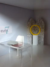
| Little Nest thinks moms would love to attend a tea party tricked out with these modern diggs. I agree. |
Lovers of mid-century modern design have discriminating taste and work hard to curate and express their design aesthetic in their nests. Once the nest begins to fill, there's no reason the nursery design should stray too far from the chic style found throughout the remainder of nest home. There are more and more resources like Dwell Studio and Little Nest to help parents remain faithful to their modern design roots. The result can be some pretty sophisticated children's spaces.
With that in mind, here's my version of a modern kid's room. A Panton "floor cloth" matches one of two modern prints. A bed with fun sheets at little people height against a bookcase headboard that has storage for everything. The lil' one has outgrown those building blocks but why throw them out when they make great decoration.
Details: Bookcase and storage inserts are from Doll's House Emporium; bed is Kaleidoscope House by Bozarts Toys; Rocker and table are ReacJapan; and wall prints are gift tags from an old issue of Domino Magazine.


5 comments:
I like! Very simple yet effective...great use of materials.
I love the colors and layout of this room!
I LOVE those Bozart beds! They are so versatile. Great combo! CM
Thanks ladies. I thought I'd experiment a little and and several colors into the scheme. The Bozart beds are always fun pieces go-to pieces.
I love the floor. Super cute room. :D
Post a Comment
Share your aesthetic sensibilities, leave a comment!