 |
| Welcome to studio7! Please add your email to our guest list. O...another exhibit celebrating typography.
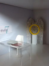
Another fun look at typography, with fun colors and even more daring word play (than the serene Love of Art exhibit). It takes the form of sculpture, standing screens and a framed lithograph. WARNING: This exhibit contains foul language...
|
   |
Details: red/silver 'F*ck' sculptures were Christmas ornaments from Urban Outfitter; small silver 'Love' sculpture was a place card holder from party supply chain; letter O (yellow) and exclamation point (orange) are from Barnes & Nobles; screens are cut from Bumble & Bumble hair product packaging; chair is ReacJapn; frame painted with by me was an eBay purchase; Desk from The Container Store; Laptop from Rement and pedestal is a napkin ring from West Elm.
|
 |
| "B" Love ! |


8 comments:
How awesome...you are on a roll!
Ha! I LOVE this! Fab job. x
Isn't that French Connection UK? ;0)
I have a soft spot for typography and I love to see it used in so many ways in miniature scenes. Lovin' it
Man, I wish I had come up with this scene. Love typography, love fonts, love this scene. The f**k sculpture is just great!!
Carry on with this wittiness.
Dory
Oh Pepper, you are soooo right those designers are clever...French Connection! Thanks doll.
I try Jazzi, I try. Almost as racy as your very own "Shades of Grey" love den? (wink).
And good look to little Jazzi as she embarks on her worldwide journey.
Why thank you, Kat.
Thanks for the encouragement. You clever mash-ups and cast of characters make me smile often, so glad I could return the favor.
Post a Comment
Share your aesthetic sensibilities, leave a comment!